Published
Location
Duration
Topic
Product
Product
Rescript Journal: How The Ash Design Turned Science and Empathy into a UX/UI Experience That Heals Emotional Wounds
Written by
Sofia Bakhtiarova


Rescript Journal became more than just another UX/UI project for us — it was a deep research and creative process, a true immersion into the world of science, psychology, and genuine human empathy.
When the client approached us with the idea for an app focused on trauma-informed journaling, we immediately understood that this project would be different. It wasn’t enough to simply design nice-looking screens or apply standard UX patterns — the design had to work on an emotional level, supporting users, guiding them through the process of expressive writing, helping them feel safe, and becoming a meaningful part of their emotional healing journey.
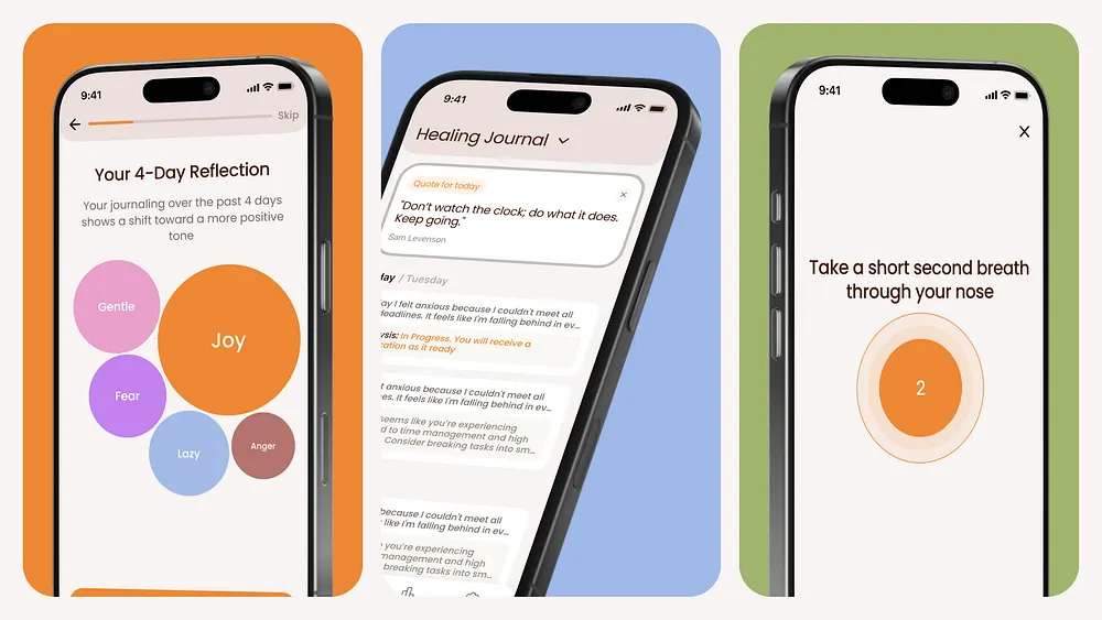
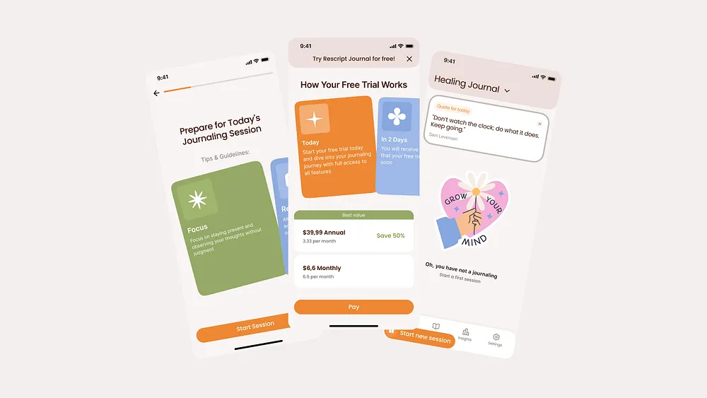
From day one, we fully dove into research. It was crucial to understand how expressive writing affects neuroplasticity, what techniques help people process trauma, and what existing apps already serve this space. We studied the method developed by James Pennebaker, which the client used as the foundation of the app — a structured 4-day writing framework proven to reduce stress and improve overall emotional well-being.
But theory is one thing — turning it into a digital product is another. Our goal was to make sure that users felt comfortable and motivated throughout the process. We weren’t just building a convenient app — we were designing an emotional path that would help users feel supported every step of the way.
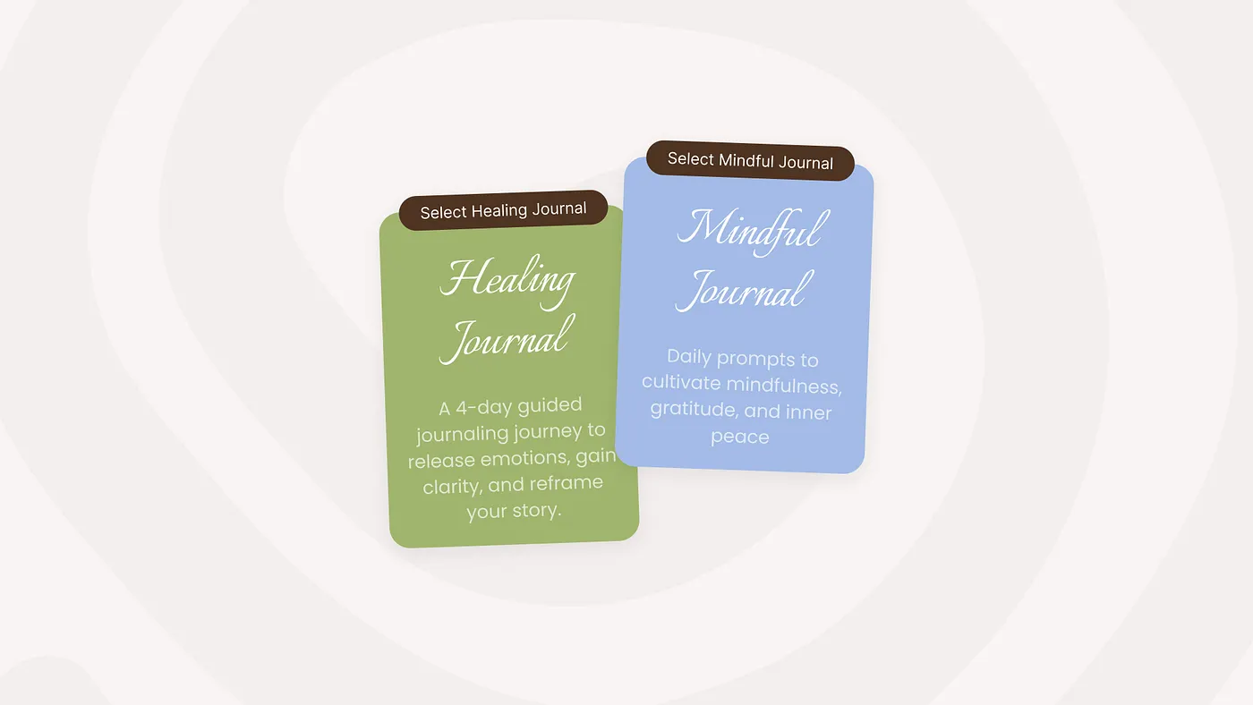
We divided the product into two key branches:
✔ Healing Journal — for deep trauma-focused writing
✔ Mindful Journal — for daily reflective journaling and mindfulness
These two directions complement one another, forming a system that helps users both in moments of emotional intensity and in building long-term habits of self-awareness.
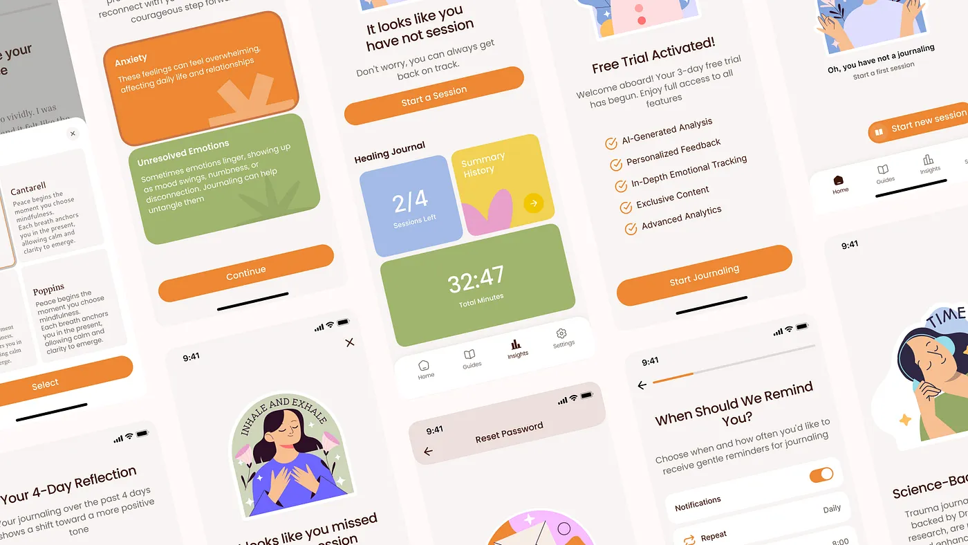
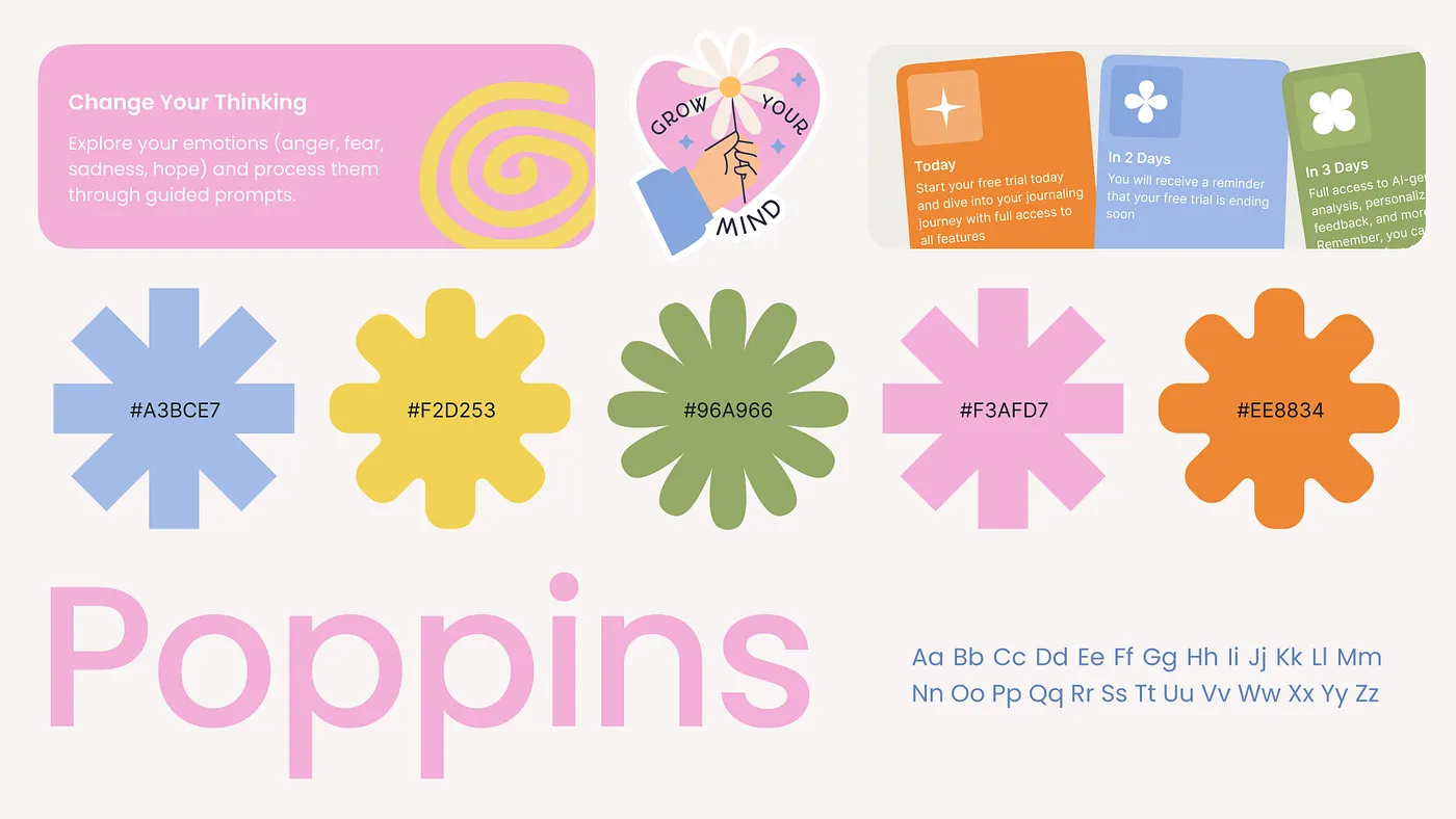
We knew that the visual style had to align with the emotional journey: no visual overload, no harsh lines, no aggressive contrast. The design needed to be warm, soft, and calming — helping users feel safe. We took inspiration from nature-inspired colors: earthy tones and gentle pastel gradients to create a comforting atmosphere. Typography also played an important role — we chose clean, rounded shapes without harsh edges to create a friendly and welcoming feeling.
With this project, we wanted to evoke a sense of safety, but without taking the obvious route. What do we usually associate with journaling? Notebooks — and each one is different. The overall concept we landed on was to bring users back to a place of creativity and childhood — many of us had journals filled with stickers, doodles, and thoughts. So that’s the direction we chose. — Sofia B., Art Director at The Ash Studio
In parallel with the design process, we worked closely with the development team to ensure that every UX detail was implemented exactly as intended. It was important for us not just to hand off the designs, but to stay involved at every stage — checking responsiveness across devices, ensuring transitions were intuitive, and making sure analytics and recommendation systems were properly integrated. Along the way, we held brainstorming sessions with the client’s team, analyzed every UX decision and logic path, and, when needed, stepped back to rethink and improve the flow — all to make sure the user journey felt seamless and emotionally supportive.
This project became both a challenge and an opportunity to create something truly meaningful. We didn’t just design an app — the Ash Design Team, together with the client and developers, created a digital companion that supports users in one of the most personal and important processes — the process of healing.
Rescript Journal is an example of how design can truly change lives when it’s based not only on visual aesthetics but also on a deep understanding of human needs.


